Y’all. Y’ALL.

ghost_sticky_note

If you’re addicted to office supplies, you might want to check out this Buzzfeed article from yesterday. On the other hand, you might want to have money left over to pay bills, so whatever you do, don’t investigate these translucent ghost sticky notes, or this totes adorbs set of stacking wooden boxes, or this freakin’ adorable otter-shaped tape dispenser. AHHHHHH.

ghost_sticky_note (1)I mean: ooooOOOOOOooh.

The Letter as Genre: Course Offered at MU

marty townsend

Photo courtesy Loren Elliott.

If you’ve been paying much attention to the “slow writing” community, you’ll remember a few uproars within the last year after various prominent journals published columns on the death of writing as our grandparents knew it. (Who can forget Nick Bilton’s melodratic opener to his eulogy to the pen?) These articles which fret over waning interest in writing forecast a return to darker times when we used our fingers as stylii, our mobile screens providing the proverbial dust in which we scratch out our barbarian acronyms. We know, of course, that the world isn’t abandoning slow writing just yet, and we know that slow writing can coexist with digital media because it provides a unique experience that the instant gratification of a text message can’t replicate.

But these articles are good for something other than exciting intergenerational tension. Last week, traditional letter-writing made front page news in my little Midwestern town in a report about a course at the university on the fine art of the letter. Marty Townsend, an English professor at the University of Missouri, received a grant from our Campus Writing Program to teach a course she designed — inspired by one of the aforementioned articles — called The Letter As Genre. My initial reaction on seeing the headline was pure frustration — frustration that I’d missed out on the class!

In addition to writing letters of their own, students “studied different kinds of letters, including correspondence written in the Middle Ages and letters from Martin Luther King Jr […,] pored over letters from politicians and soldiers, friends and lovers [, and] read the love letters from John and Abigail Adams, Warren G. Harding, Virginia Woolf and others.” Some students reported taking up letter writing on their own time because of the class.

You can read the article in full here. I’m including the full text beneath the cut here so it’s still accessible after the article locks to subscribers only.


Continue reading

Linkage: Snail Mail Data Design

DearData-week06-Stefanie

Image from dear-data.com

From a report at Wired:

Information designers Giorgia Lupi and Stefanie Posavec have been engaged in a  curious kind of correspondence for the past 28 weeks: postcards featuring meticulously hand-drawn compilations of “small data” generated in their daily lives.

Each postcard features a kind of graph on one side: from a collection of colorful circles, composed of hash marks and resembling Old Gallifreyan script, that report phone usage to a series of what appear at first glance to be very odd musical phrases and turn out to be a graph of “musical complaints.” The other side of each postcard offers a legend to reading the graph.

They plan to spend a year on the project, which they are calling Dear Data. You can see the whole thing here at their website. Definitely take some time to browse through the images collected there. It’s a fascinating approach to correspondence, art, information and graphic design, and journaling, one that could prove inspirational for many of us humble pen bloggers/correspondees/diarists/note-takers/marginalia artists/what-have-you. After all, many of us could consider ourselves “information designers” of a sort!

Modern Desk Essentials: Make a Correspondence Kit

IMG_2867
Recently I found myself writing a letter to a friend who resolved to be a better letter-writer this year. It’s been almost a year since I myself started my letter-writing project (the first anniversary is in March), and while I’ve written more letters over these past eleven months than I have in the rest of my years combined, I know I too have room for improvement. However, I’ve also developed a system that helps hugely in the turnover rate of my correspondence. This how-to post serves not only as advice for pen-friends looking to streamline their postal process, but as a reminder to myself of the reasons why this blog even exists!

1. Find a Container

IMG_2870
Get yourself a box or a special, durable folder in which to stash your correspondence gear. Portability is a top priority here, but if your container is also attractive and unique you’ll use it more often. I have an A4-sized cardboard document folio for this purpose, emblazoned with a map of Germany, which not only serves as a quick reference tool but is also a good conversation starter! My friend Maria gave it to me and I think they are fairly common in Germany, sold as Sammelboxen or Heftboxen. These cardboard boxes also work well as a lap-desk if you take your kit to go.

Here is a German-language site where you can order all different kinds of cool Heftboxen, including the one pictured above!  I like this one with black and white flowers, this map of Europe, and the map of the world. But I’d add the Rolling Stones one to my collection in a heartbeat.

Assemble the Essentials

IMG_2869

Then assemble a collection of everything you need to write AND SEND a letter:

  • Beautiful stationery.
    • It doesn’t have to be the high-quality stuff you keep in your top desk drawer, and in fact I’d recommend keeping your boxed set of Crane’s paper in the desk, especially if you plan on making this a portable correspondence kit! Your correspondence kit should contain, rather, all-purpose stationery that can hold up to a little shuffling around in your Heftbox. Notecards, postcards, or a colorful stationery set from Papyrus or — better yet — an independent seller on Etsy will do very well.
  • A favorite pen.
    • If you’re not the type to carry around a fountain pen wherever you go, at least put one in your correspondence kit. A Kaweco Classic Sport with a fine nib is inexpensive, small, takes international cartridges, and makes writing a fine and special experience that will inspire you to write more.
  • A pretty address book.
    • I use a Roterfaden address book: it’s size A6 so it has plenty of room for collecting all the addresses I will ever need to use.
  • A book of cool stamps.
    • Your local post office should have some variety. I like ordering online because there are so many more to choose from! American customers, go to the USPS website. A word of caution: Buying stamps can become a bad habit.

An anecdote: just as I was writing this, my supervisor sighed and muttered to herself, “No stamp.
“Do you need a stamp?” I asked her across our desks, trying to conceal my eagerness and failing pretty badly.
She said yes, starting to laugh at herself. She told me she’d gotten this important letter all ready to send off but had completely forgotten a stamp at home.
“I have stamps!” I offered. “What kind would you like?”
“Oh, just a plain first-class forever stamp.”
“Yes, but what kind?” I prompted. “I have Year of the Ram, Batman, Jimi Hendrix, famous choreographers, Harry Potter, Civil War battles, birds, flowers, 2013 and 2014 Christmas, and Hudson River School stamps….” I didn’t even mention the international and alternate denominations. “Plain” is not a word that exists in my stationery vocabulary.

I keep extra fun things in my letter kit, especially stickers — check out those Karas Kustoms decals and the puffy fox stickers! I have a transparent file to hold my stamps and stickers, and an accordion file (not pictured) for note- and post-cards, plus any interesting flyers or paper ephemera my penpals might like. Also: nifty canceled stamps from far-off friends. These are fun to decorate envelopes with.

IMG_2844
How To Use

When you get a letter, if you can’t answer it immediately, put it somewhere you can’t forget about it. I’ll often put mine on my laptop or at my place at the breakfast table, where I take care of most of my correspondence.

As soon as you get a chance, sit down at a table or a desk with the letter and your kit and answer it. Try to do it all in one go. Don’t worry about your letter not being long enough; sometimes you just have time for a couple of pages. Anyway, when was the last time you got a letter and were disappointed because it wasn’t eight pages long?

Seal, address, and stamp it immediately and go stick it in the mail. If you’re like me, the process gets hung up at this stage, so be extra vigilant here.

Et voila! You’ve become a prompt penpal!

 Extras

The advanced letter writing kit also contains:

Handmade envelopes
A writing mat
Washi tape
Rubber stamps and multicolored stamp pads
Small scissors
Glue
Crayons, colored pencils, or markers
Custom address labels and/or address stamp
Letter Writers Alliance membership card ($5 for lifetime membership!)
Guide to postage prices (ask or leave a note for your post person)
A guide to correspondence etiquette (take it with a grain of salt or leave it)
Familiarity with a few topical/epistolary novels, e.g. The Sorrows of Young Werther, Love in the Time of Cholera, or Ella Minnow Pea (just kidding — but it’s good to have a couple of relevant passages memorized that you can whip out and impress your penpals with!)

 IMG_2840
I also keep a record of incoming and outgoing mail. To get the Penventory look: order one $10 set of Field Notes’ “Ambition” edition. Use the olive-green ledger to record each piece of mail that passes through your fingers. Like so:

IMG_2841
At a single glance I can see if there are any letters that need replying to and I also have a physical record of my productivity! And the subject helps me keep track of dozens of conversations (because who can remember what they cooked for dinner last night, let alone whether they’ve told a penpal XYZ?).

IMG_2880
The most important element of your correspondence kit: creativity! Feel free to “think outside the envelope” when it comes to writing letters. Avoid the dreaded “How are you? I’m fine” opener. Wax lyrical on your favorite breakfast item. Write an ode to your cat. Compose an entire letter without once using the letter “E.” Make up fanfiction about your grade school music teacher who was, you were pretty sure, an undercover international spy.

And get personal. Handwritten letters are intimate. They’re a little piece of your soul, gift-wrapped for another human being. Think deep thoughts and ask hard questions. Let your letters expand you and your correspondee to encompass worlds of words.

Hobo Life: The Hobonichi Techo Planner 2015

IMG_2759
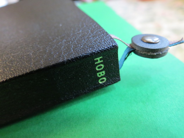
One of the things I love best about this planner is that it says “hobo” on the spine, which pretty accurately sums up my lifestyle and aesthetic.

But seriously: the Techo is a fantastic planner and a beautiful piece of craftsmanship. Manufactured by the Japanese company Hobo Nikkan Toi Shinbun (translation: “Almost Everyday,” and Hobonichi for short), the Techo planner has been around since 2001, and its design is updated and refined every year. The first English version was made available in 2012.

IMG_2753

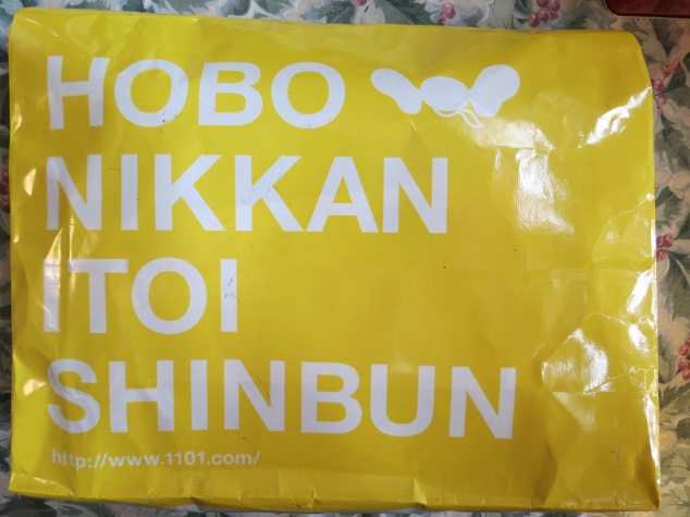
My Techo shipped in this big, crinkly, yellow bag!

Here are the stats on my desk’s new best friend:

– Size: A6 (5.8″x 4.1″). Note: the Hobonichi A6 is NOT the same as some other notebooks labeled A6, such as the Rhodia A6 Webbie or the Leuchtturm. I am looking in to this discrepancy but from what I can tell, it’s likely that occidental and oriental standards differ. In any case, keep in mind actual dimensions if you want to purchase a cover for your Techo somewhere other than the Hobonichi website.

Uncovered Techo with my Delrin Render K. The front of the planner has the Japanese characters for "Te" and "cho" followed by the logo of ARTS&SCIENCE, the company that did art direction for this year's Techo.

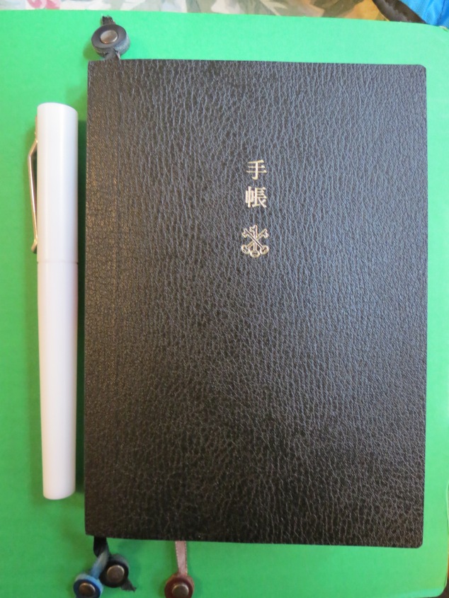
Uncovered Techo with my Delrin Render K. The front of the planner has the Japanese characters for “Te” and “cho” followed by the logo of ARTS&SCIENCE, the company that did art direction for this year’s Techo.

– Over 400 pages of bleed-resistant, tissue-thin, fountain-pen-friendly Tomoe River paper in a lay-flat binding. This planner is super flexible and springs right back into shape. The covers are black, leather-textured, and tough although they’re just coated card. (The Hobonichi is made to be put in a refillable cover — more on that in a later post.) The corners are rounded so as to minimize damage to an uncovered Techo.

– Includes yearly, monthly, and daily pages. The Hobonichi stores sells ribbon bookmarks for the Techo that include three different ribbons, which means you can always have the month marked as well as the day with the third ribbon reserved for the note section in the back.

IMG_2767
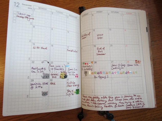
– Immaculate printing in a deep charcoal with Sundays highlighted in red (really more a persimmon burnt-orange — a very smart, modern color combination, especially when paired with the pale sage end papers). The 4mm graph lines on the daily pages provide a guide without being obtrusive, making daily pages useful for sketching as well as taking notes. Same goes for the dot-grid pages in the back, which are printed in Sunday-orange. (I’m using a couple pages to keep track of Good Names For Bands, a list of books I want to read this year, and a stationery wish list, of course.)

IMG_2772
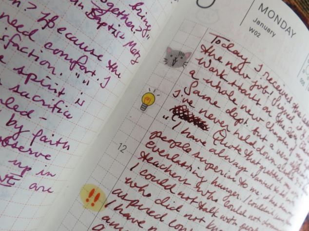
– Each daily page shows the moon phase, international holidays, a mini-calendar so you can see at a glance exactly where you are in the month, and — really cool — a customizable time grid, which means that only noon is marked, set off by the number “12” halfway down the grid. At the very bottom is a little fork-and-knife symbol so you can schedule in dinner plans if you like. They also include daily quotes taken from articles on the Hobonichi website. My favorite so far is the one for Valentine’s Day:

“Boys! We don’t get you at all!
So don’t give us more of your sing-song.
Tell us what you really feel.
Your metaphors don’t work at all anymore.
Because we women are just too busy.”
– The Association to Sing Love Songs

You can read more about these features and see some really gorgeous photos at the Techo “features” page.

So how does this all stack up in terms of actual use? Well, I have a terrible track record with planners, possibly because I like collecting notebooks as much as using them and sticking to a single one for a year has been beyond my capacity thus far. But the Techo is useful on so many levels, and the layout of the single-day pages make them easily adapted to so many uses: to-do lists, journal entries, scrapbook (to an extent), sketchbook, in addition to whatever you’d normally put in a planner. One of my favorite new blogs is Hobonichi Love, where you can see photos submitted by users of the infinite artistic ways they’ve used their Techos!

Another thing that makes this planner so attractive is Hobonichi’s dedication to constantly improving their product. The 2015 edition introduced three new features: the dinner icon at the bottom of the daily time grid; a two-days-per-page section for the following year, so if next year’s Techo doesn’t arrive before January 1 you can keep recording and/or plan ahead; and next year’s calendar pages (of which there are three following December 2015) “watermarked” with a big, unmistakeable “2016” so you don’t mistake them for 2015’s calendar spreads.

And while I do have this terrible track record with planners, I’ve recently started a new job that makes it necessary to keep one. Not only do I use it to keep track of long-term projects and short-term tasks, but it’s also a record of professional development. It’s indispensable!

If you didn’t pick up a Techo in time to start in January, you can purchase the Hobonichi “Original” planner, which is only available in Japanese but whose daily pages run from March 1, 2015 to March 31, 2016.

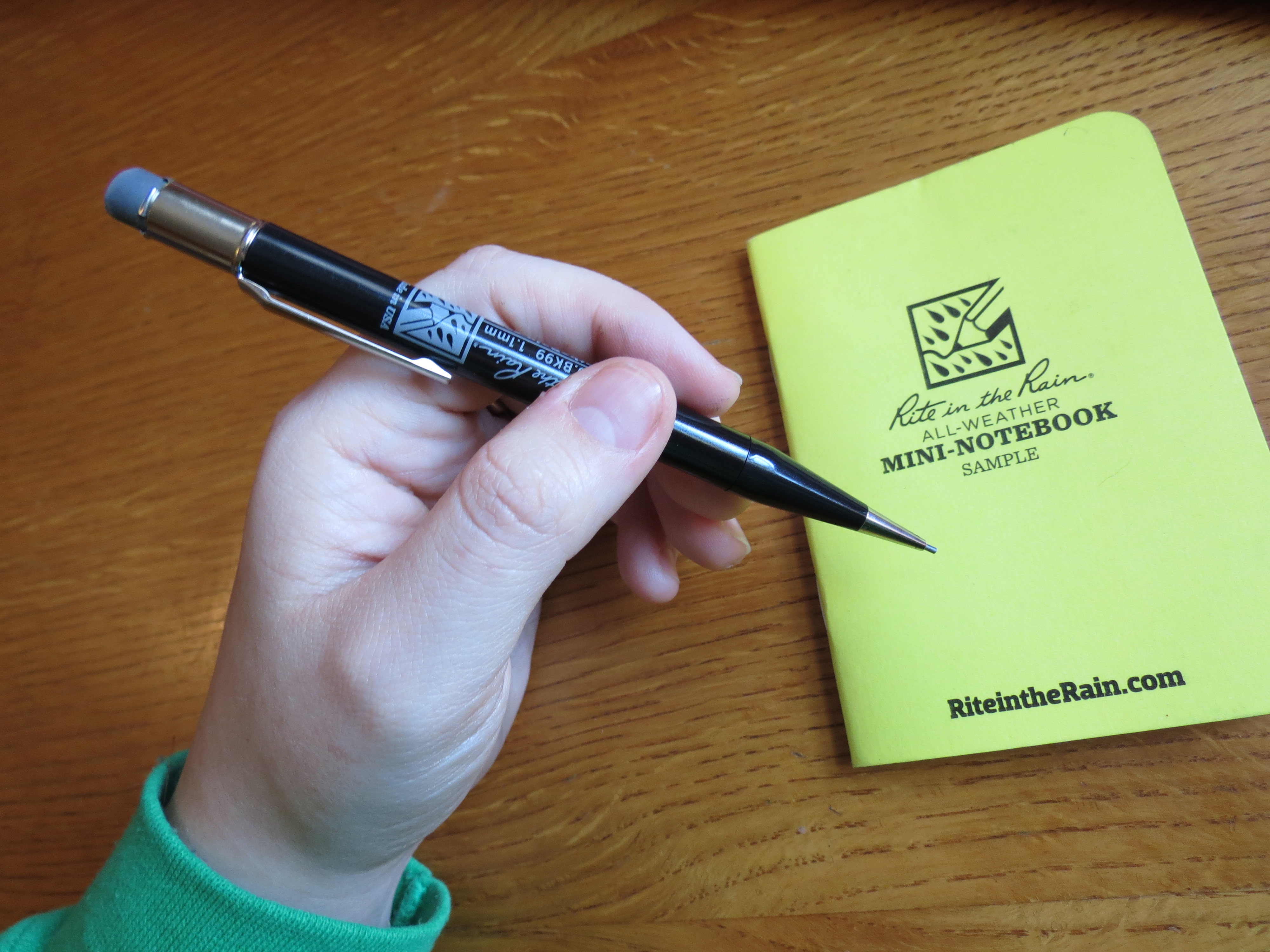
The Techo will put you back by $35-$40 US dollars depending on exchange rates and customs. But it’s completely worth it in my opinion to have a dedicated page-a-day planner in a sleek, modern design that accommodates even the wettest fountain pen nib!

InCoWriMo 2015

incowrimo

February is InCoWriMo – International Correspondence Writing Month, a High Holy Day here at the Penventory! The gist of it? Twenty-eight letters in twenty-eight days. Hand-written, hand-stamped, hand-delivered — whether you go USPS, UPS, or Owl Post, so long as it’s snail mail, it counts.

You can learn more about InCoWriMo at the official website here. And if you’re at a loss as to whom to write, check out this list of twenty-eight people who would love to receive mail from you during February! (And you can add your own address in the comments, too.)

Don’t forget: a lifetime membership with the Letter Writers Alliance is only $5 and grants you access to the members-only shop and their fantastic penpal service, through which I’ve already found a couple of faithful correspondents.

My first letter, though, is to my dear father-in-law — a postcard with a cake recipe I’ve been meaning to give him. (Shh, don’t tell him — it’s a secret.)

Who are you writing to this month? Got any special packages to send? Let me know in the comments!

A.G. Spalding & Bros Maple-Bodied Pen

IMG_2696

A. G. Spalding & Bros – maple-bodied fountain pen
+ natural finish
+ medium nib
+ Kaweco Turquoise

I have to admit: I bought this pen solely because of its looks. Shallow, I know.

IMG_2693

But there is something about it that’s different: the warmth of the natural wooden barrel bookended by the sturdy aluminum of the cap and the posting end… well, it looks like a pen you’d find in the hand of a pipe-smoking, fastidious car mechanic in the 1950s, the only guy you’d want working on your car. It seems well-engineered to be both hard-working and attractive.

IMG_2691

And it’s got character! The nib, while rather plain, is incredibly wet, smooth, and fun to use. It wrote well right out of the box, no flushing required. The cap snaps off the top and posts with a solid click, though posting definitely renders it really back-heavy. I’m not a fan of the grip, which is miniscule at 1cm long, so I actually grip the wooden barrel, which is more then comfortable. The clip is tight but not totally inflexible, and the way it’s attached to the cap means that, with some effort, you can twist it around to whatever position suits you.

IMG_2687

Effortless, juicy lines.

IMG_2684

Ultimately, this is a very nice pen — I only wish my natural handwriting wasn’t so small and therefore unsuited to the breadth of the line! I’m afraid it’ll probably not get used the way it should.

“And so I’m back / From outer space”

IMG_2744Hello, Pen-Friends, it’s good to be back from my regrettably long, unplanned hiatus! 2014 was a hard year, but 2015 is looking promising already. I’ve accepted a position as an administrative assistant in my department. What that means for this blog is that I’ll have even greater excuse need to invest in quality stationery products, pens, and other office supplies. Additionally, our tabletop gaming schedule is filling up, so I plan to include reviews of various products that prove invaluable to the success of our epic quests, including session sketches like I’ve done in the past.

Some products you can look forward to seeing reviewed on the Penventory in the coming months include the Delta Unica in Orange (limited to 100 pieces, exclusive to the Goulet Pen Co.), the now-discontinued TWSBI Micarta, the Hobonichi Techo planner for 2015, and the Roterfaden Taschenbegleiter, among many others. There might even be a guest post or two and reviews of some relevant books! Additionally, I will continue to add items to my Tomoe River Paper Master Post, which continues to be a popular resource.

What are your resolutions for 2015? Did you get any awesome pens for Christmas? What are you looking forward to trying out this year? Is there anything you want more or less of from the Penventory? Hit me up in the comments!

Letter-Writing Advice From the 18th Century

Shannon Chamberlain published an interesting article yesterday at The Atlantic about business correspondence manuals in the 18th century and how they helped people to improve and refine their communication. It’s an interesting article, especially some of her thoughts toward the end about how the correspondence manual might be a helpful tool even today:

Even as we learn that young people do more writing these days than ever, we bemoan their lack of basic communication skills, the influence of texting on their orthography, and the fact that they talk like Internet cats to their potential employers.

The banal familiarity of the handwringing about the younger generation’s foibles doesn’t quite dull the shock of getting an email addressed “heyyyyy profesor” or punctuated with “dude” in lieu of commas or periods (I am not a dude). But there are other, subtler ways in which the world of the 18th-century correspondence manual resonates with our current context, ones that suggest that a revival of the letter-writing manual might be in order.

She also writes that in 1751, the Earl of Chesterfield offered some advice to his son Philip on the topic of his business correspondence: “In business, an elegant simplicity, the result of care, not of labor, is required.” Good advice even today for those of us whose occupation involves correspondence, whether it’s email or even text message. At its heart, this is why I prefer the carefully-written text message to emails or telephone calls when coordinating or exchanging quick bits of information: the nature of the text message is brevity above all, inclining one to dispense with the very American tendency to pad communication with small-talk and other filler.

Check out the article, and let me know your thoughts. Do you think there’s a use for correspondence manuals in today’s realm of business communication? Do you bemoan the influence of text messaging, or do you think there’s something redeemable there?

I’ve Got 99 Problems, but This Ain’t One: Rite in the Rain’s No. 99

IMG_2739

Rite in the Rain: No. BK99
Black heavy-duty mechanical pencil + 1.1mm lead refills

This is my first experience with Rite in the Rain’s products. Jim K. from their PR team contacted me and asked if I’d be interested in doing a review of the No. 99 mechanical pencil, even though it’s a bit different from what I usually cover. But one of my main goals in writing this blog is to incorporate more handwriting in my daily life. While I usually grab for a pen instead of a pencil (and, naturally, a fountain pen at that), there are still definitely times when a pencil comes in handy. I drafted the original version of this review in the little sample pocket notebook that came along with the pencil (and I’ll have to do a review of the paper too, but I’m saving that for a later date).

IMG_2733

What I love about this pencil:

– Its sturdy construction. The barrel is made of synthetic resin, at least 1mm thick at the thinnest point and reaching up to 3mm thick. This is no dinky plastic Bic click-pencil. The fixtures are metal, too, so there’s no sacrifice in quality on the little details.

IMG_2737

– 1.1mm lead. I usually prefer finer points than this, but for a utility pencil it’s perfectly appropriate, not just for visibility of written text, but for durability of the refills. They are both thicker and shorter than standard refills, making them resistant to breakage inside the pen. They’re not especially soft, so while the line isn’t super dark, this lead sticks around! Note the lead at the bottom of the set: that is after about a week of use, writing this review and jotting down ephemera in my Field Notes.

IMG_2735

The way you load the lead is also different: you feed it in from the back of the cone, and you lock it in with the included metal plunger, which not only secures it but acts as the mechanism to work new graphite up to the point. (One criticism: I’d never seen a pencil with such a mechanism and it took me a good five minutes to figure out how the heck to put this thing together. What the packaging doesn’t mention is that the plunger goes in after the graphite. Rite in the Rain could clarify this on their packaging for dummies like me!)

IMG_2738

– Very long taper to the cone. I hold pens and pencils farther back than the average bear, and it’s my cross to bear that I’m usually grabbing onto uncomfortable threads. This cone is just under 1.5″ long from plastic base to metal tip. The seam between cone and body is noticeable, but not uncomfortable, and I find gripping right at the base of the taper to be comfortable and secure.

IMG_2734

– Eraser is easily replaced. Several folks who’ve done reviews on this pencil sing the praises of this eraser, and I’m fond of it, too — grey with a dull shine, but very soft. The refills come in a little metal clip so you don’t have to struggle with prying out an eraser you’ve worn down too flat. (The curse of the ordinary mechanical pencil!) You just grab the rim of the metal clip with your fingernails and pull the whole thing out.

– Clip has some flex to it, and is secure. I have no problem clipping it around the whole pocket notebook they sent, and I don’t have to worry about flexing it too far.

– Branding is cool, sort of old-school-cataloging/inventory-chic. And whatever they use to print their text and image onto the barrel with is un-scratch-off-able! At least when subjected to the moderate abrasive properties of my fingernail.

When I first drafted this review, I wrote “Design is a bit ‘blah.'” I meant this aesthetically; the engineering of this pencil is excellent. But actually, over time the design has really grown on me, and I think the red and yellow versions are even snazzier than the black.

So as far as cons to this pencil, I really only have one:

– The difficulty of finding 1.1mm lead could make it hard to refill. This is one big down-side to this pencil. I have no problem ordering refills online from Rite in the Rain, but the advantage a Bic click-pencil or a traditional wooden pencil has over this guy is that they’re easily available.

IMG_2741

Overall, I am really enjoying this pencil; it’s even spent some time in my EDC Hightower pen case this weekend. The non-pen-geeks I’ve shown it to have been enthusiastic about it, too. I can see it making a really good gift for tabletop gamers (can’t deface a character sheet with ink, of course!), or musicians who take their show on the road and frequently find themselves penciling in notes on their sheet music. Of course, it would also be perfect for outdoorsy types who like to take notes or quick sketches on a hike.


The products in this review were provided free of charge for purpose of review. These are my unbiased opinions.